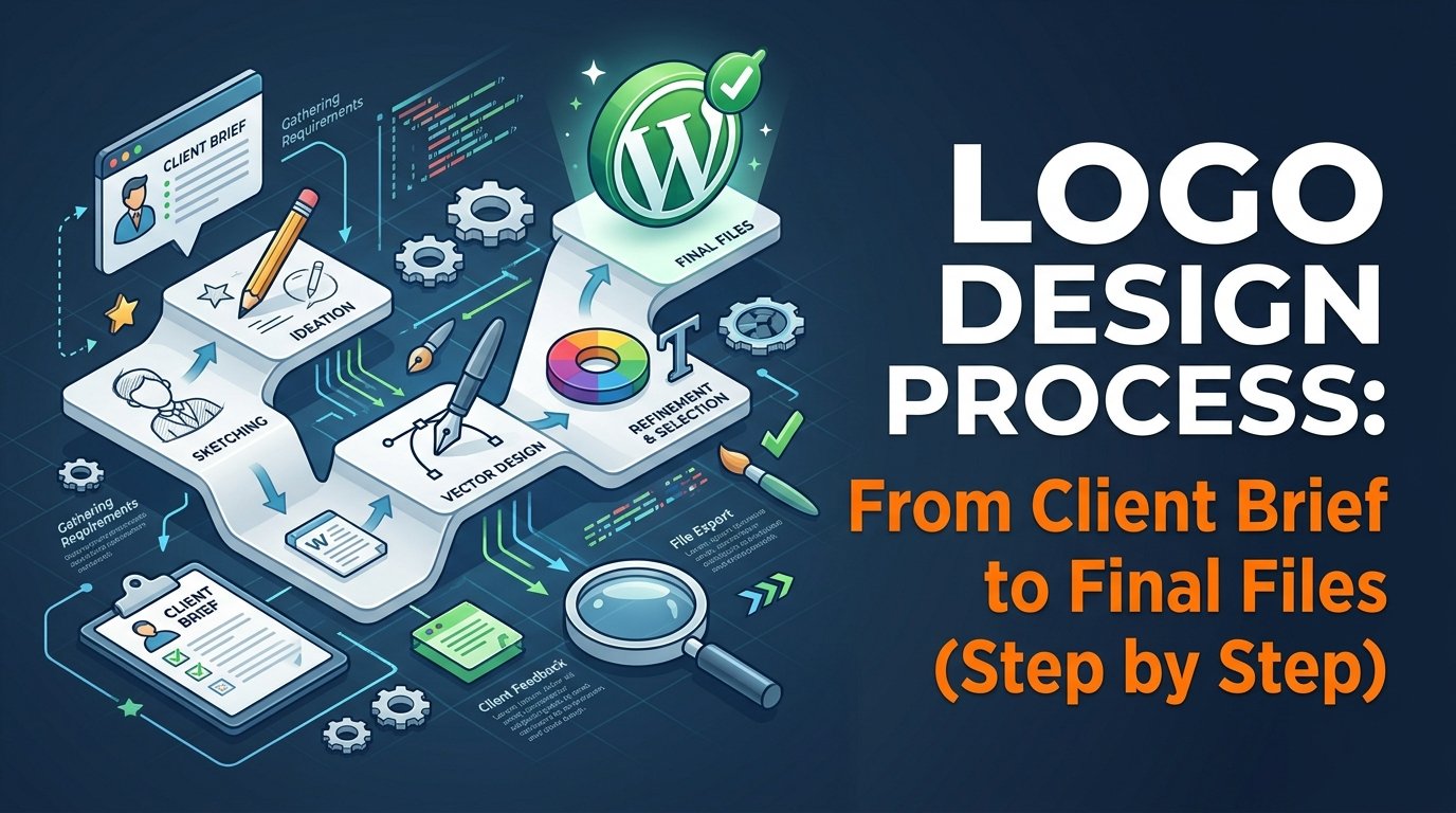
A good logo is not a lucky idea. It comes from a clear process: understand the business, explore many ideas, refine the best one and deliver the right files. This guide walks through a seven-step logo design process that beginners can follow, from the first client message to the final delivery.
In short: brief → research → sketches → digital concepts → feedback → final polish → file delivery.
🎓 Want to learn logo and brand design hands-on? Explore the design courses at Tech Pulse, with practice projects you can add to your portfolio.
Step 1: Get a clear brief
Before you open any software, ask the client questions. A short brief saves days of revisions later.
- What does the business do, and who are its customers?
- What three words should the logo make people feel?
- Which logos or brands does the client like, and why?
- Where will the logo be used: social media, signboard, packaging, website?
- Are there colors, symbols or names to avoid?
- What are the deadline and the number of revisions?
Step 2: Research the business and competitors
Look at the client’s industry and competitors. Note what they all do the same way, then decide how your design can feel different while still fitting the field. Collect examples of styles, color moods and typefaces on a simple mood board.
Step 3: Sketch many ideas on paper
Sketching is faster than designing on a computer, and it keeps you from locking in your first idea. Aim for at least 15 to 20 small sketches. Try symbols, lettering, monograms and combinations. Pick the three to five strongest ideas to develop further.
Step 4: Build digital concepts
Redraw the best sketches in a vector tool such as Illustrator, Inkscape or Figma. Keep these rules in mind:
- Simple: the logo should still work when it is very small.
- Memorable: one clear idea is better than many small details.
- Flexible: it should look good in black and white, on dark and light backgrounds.
- Appropriate: the style should suit the business and its customers.
Start in black and white. Add color only after the shape works.
Step 5: Present and collect feedback
Show two or three concepts, not ten. Explain the idea behind each in one or two sentences, and show each one on simple mockups such as a business card or social profile. Ask for specific feedback: what works, what does not, and why. Agree on the next round before you start editing.
Step 6: Refine and finalize
Fix spacing, alignment, curves and letter gaps. Test the logo at small and large sizes, in one color and in full color. Check that the typeface license allows commercial use, and that every element is your own or properly licensed.
Step 7: Deliver the final files
| File type | Used for |
|---|---|
| AI / SVG (vector) | Scaling to any size, printing, signboards |
| PDF (vector) | Sharing with printers |
| PNG with transparent background | Websites, social media, presentations |
| JPG | Quick previews and documents |
| Color and black-and-white versions | Different backgrounds and print types |
Add a one-page guide showing the colors (HEX and CMYK codes), fonts and the minimum clear space around the logo. This small extra makes your work look professional.
Common beginner mistakes
- Starting on the computer without sketching
- Using too many colors, effects or tiny details
- Copying or tracing existing logos
- Using unlicensed fonts or stock icons
- Skipping the brief and guessing what the client wants
- Delivering only a JPG or PNG
Logo project checklist
✅ Check before you deliver
- Written brief and approved deadline
- Competitor research and mood board done
- At least 15 sketches made
- Logo works in black and white and at small size
- Fonts and assets licensed for commercial use
- Vector, PNG and PDF files exported
- Color and font guide included
- Written approval from the client
Frequently asked questions
How many logo concepts should I show a client?
Two or three strong concepts are usually enough. Too many options confuse clients and weaken your own recommendation.
Which software is best for logo design?
Any vector tool works. Illustrator is an industry standard, while Inkscape and Figma are free options. Choose the one you can use confidently.
How many revisions should I offer?
Agree on a number before starting, such as two or three rounds, and put it in writing. Extra rounds can be charged separately.
Can I use AI-generated logos for clients?
Rules about ownership and copyright for AI-generated images vary and keep changing. Check the terms of the tool you use and tell the client how the logo was made.
A simple example brief
Imagine a small bakery asks for a logo. The brief might say: friendly, warm, family-run, used on boxes and Facebook. From that, your research board could show round shapes, hand-drawn lettering and warm brown and cream colors. Your sketches then explore a wheat symbol, a bread-and-initial monogram and a simple wordmark. Two of these become digital concepts, and the client picks one for refinement.
Notice that every decision traces back to the brief. When a client asks “why this color?”, you can answer with the goal, not with personal taste. That is what makes a logo process feel professional, even for a beginner.
Time and revisions
A small logo project often takes several days from brief to delivery, depending on the client feedback speed. Write your timeline and the number of revision rounds in your first message, and ask for written approval before sending final files. For ready-made wording, see our freelance client email templates.
Related reading
🚀 Build real logo projects for your portfolio. See our design courses and start practicing with guided projects.
About the author: Reza is a Dhaka-based freelance graphic and web designer. He teaches design and online skills at Tech Pulse.