
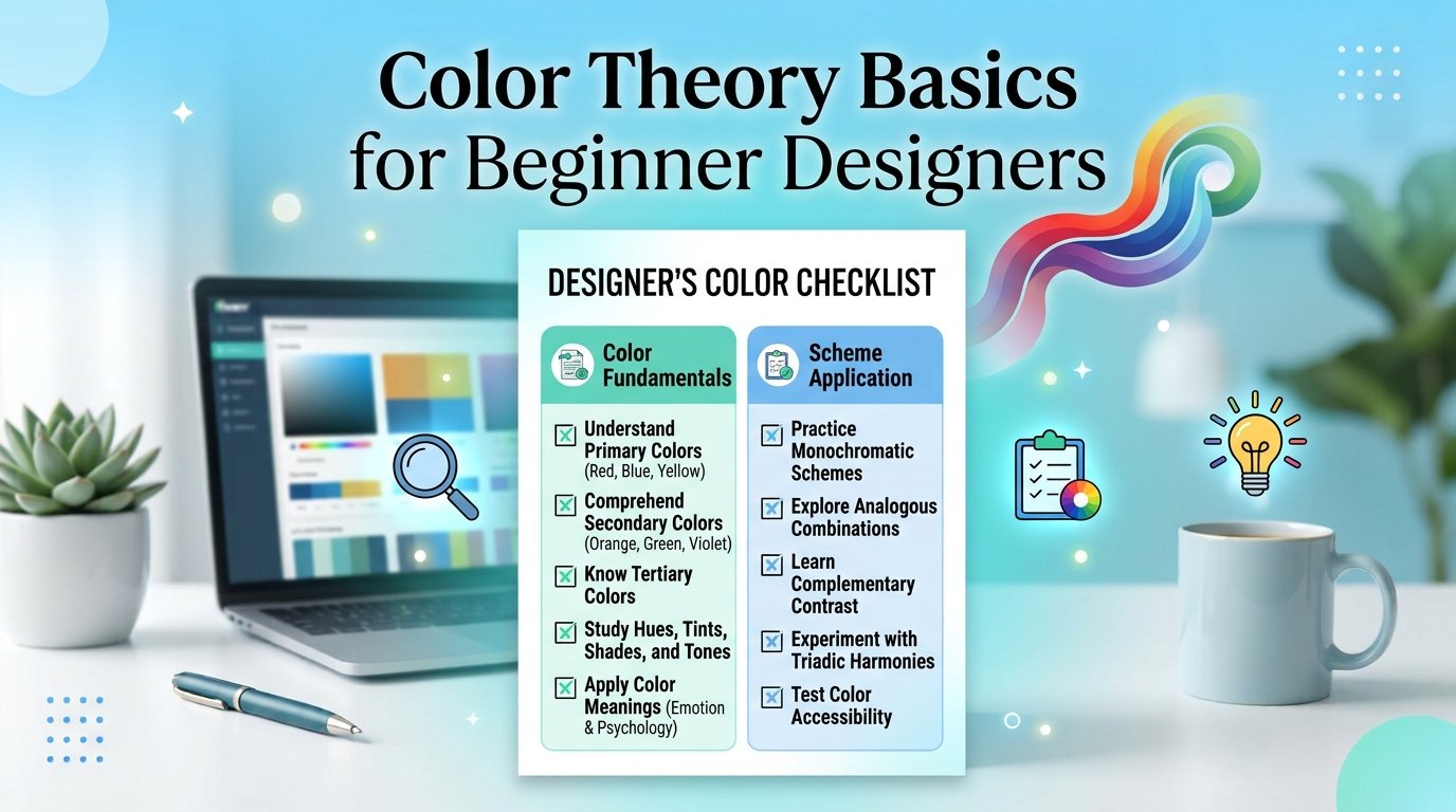
Good color choices make a design look professional, while poor ones make even a good idea look amateur. You do not need art school to use color well. This guide explains the color wheel, five easy color schemes, the 60-30-10 rule and contrast, then lets you practice with a checklist and a short quiz.
In short: choose one main color, one neutral and one accent, keep strong contrast, and test your design in black and white.
🎓 Want to learn this hands-on? Explore the courses at Tech Pulse.
The color wheel in one minute
Every color scheme starts from the color wheel. Primary colors are red, yellow and blue in traditional art. Mixing two of them gives secondary colors: orange, green and purple. Mixing a primary with a neighbouring secondary gives tertiary colors such as red-orange. Screens, however, mix light using red, green and blue (RGB), while printers mix ink using cyan, magenta, yellow and black (CMYK).
Five simple color schemes
| Scheme | How it works | Feeling | Good for |
|---|---|---|---|
| Monochromatic | One hue in light and dark versions | Calm, clean | Minimal logos, websites |
| Analogous | Neighbouring colors on the wheel | Harmonious | Nature, wellness, backgrounds |
| Complementary | Opposite colors on the wheel | Bold, high contrast | Buttons, sale banners |
| Triadic | Three evenly spaced colors | Lively, playful | Kids, events, creative brands |
| Neutral plus accent | Greys, white or black with one bright color | Modern, focused | Business and tech designs |
What colors often communicate
Color meanings differ across cultures and situations, so treat these as common associations, not rules.
| Color | Common associations |
|---|---|
| 🟥 Red | Energy, urgency, passion |
| 🟦 Blue | Trust, calm, technology |
| 🟩 Green | Growth, health, nature |
| 🟨 Yellow | Optimism, attention |
| 🟪 Purple | Creativity, luxury |
| ⬛ Black and ⬜ white | Elegance, simplicity, space |
The 60-30-10 rule
A balanced layout often uses one main color for about 60 percent of the space, a secondary color for about 30 percent and an accent for about 10 percent. The accent is what you use for buttons or key words, so it draws the eye. For example, a cafe poster might use cream for 60 percent, dark brown for 30 percent and orange for 10 percent.
Contrast and readability
Beautiful colors are useless if people cannot read the text. Light grey text on a white background, or red text on a green background, is hard to read for many people, including those with color vision differences. Use dark text on light backgrounds or the reverse, and check your contrast with a free online contrast checker. Never use color as the only way to show meaning; add an icon or label too.
Understanding HEX codes
A HEX code such as #1E73BE describes a screen color. The six characters are three pairs for red, green and blue. Designers save the HEX codes for their brand so every page uses exactly the same colors. When you deliver a logo, include these codes in a small guide, as explained in our logo design process.
Try it yourself: palette checklist
- I chose one main color and know why
- I chose one neutral for backgrounds and text
- I chose one accent for buttons or highlights
- I used no more than three to five colors
- My text passes a contrast check
- I tested the design in black and white
- I saved my HEX codes in a note
Quick quiz
1. You need a button to stand out on a blue page. Which color pair is best?
An orange or yellow button. Orange sits opposite blue on the wheel, so this is a complementary choice that gives strong contrast.
2. A design looks messy with seven colors. What should you do?
Reduce the palette to one main color, one neutral and one accent, then use lighter and darker shades of the main color if you need variety.
3. Which is safer for body text: pale grey on white or dark grey on white?
Dark grey on white. It has much better contrast and is easier to read.
Frequently asked questions
Do I need to memorize the color wheel?
No. Understand the relationships, then use a free palette tool to explore. Many tools are listed in our guide to free graphic design tools.
RGB or CMYK: which should I use?
Use RGB for anything shown on screens and CMYK for print. Ask your printer which they prefer.
How do I pick colors for a client’s logo?
Start from the brief: the business, the audience and the feeling they want. Test the logo in black and white first, then add color.
Related reading
- সেরা ফ্রি গ্রাফিক ডিজাইন টুল
- Logo design process, step by step
- গ্রাফিক ডিজাইন পোর্টফোলিও কীভাবে বানাবেন
🚀 Ready for the next step? See the Tech Pulse courses and learn step by step.
About the author: Reza is a Dhaka-based freelance graphic and web designer. He teaches design and online skills at Tech Pulse.